2.1
Part 1

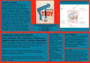

Part 2


During design this year I have been constructing a design brief for my own company. I’ve decided to go with a Boba shop company because I thought it would be fun to design and create. Below is the mood board that I’ve created which has a color palette, logo inspirations, images representing my keywords, and some fonts.

After completing my mood board I then moved on to my logo design. Below is my design process leading to my final product. I have several concept designs, and you can see how I’ve changed the color palette slightly to a lighter pastel. I did this because I thought it looked more appealing and aesthetic. Below is the process of my logo and how I’ve created it. I began by using a boba cup as my base and incorporating different colors and details into it, for example, the whipped cream and drips on the top of the cup. I kept referring back to my mood board for inspiration, and I got most of my inspiration from the logos on the board. I thought the block colors looked plain, so I added some gradients to add some shape. The hardest part for me was incorporating the company name into the logo. I had to test a few different fonts and text placements until I found one I liked.

The final product is the design on the bottom right corner. I liked how I used gradients in the cup and the whipped cream to give it a 3D effect. While experimenting with the design, I realised I the straw needed to be seen from inside the cup so I added that. Although the name ‘Pearl Palace” doesn’t stand out much on my final design, I thought the black clashed with the light pastel theme, so I settled on the purple.
In art, we were told to create four mood boards, each based on a different theme. We researched and studied various artists for each theme, selecting and gathering artwork that aligned with the theme. Below are my mood boards and an explanation of my thought process behind each one.
For this moodboard, I selected one or two artworks from each artist that stood out to me. The artists I researched included Rodchenko, Askew One, and some others from linked websites. I liked how most of these artworks stood out, especially the graphite ones. I also liked the simplicity of the black cat piece and the 3D effect in the New York artwork. I created and added color palettes that I felt matched the art and my personal preferences.


I chose these artworks from each artist because I liked how they were simple, vibrant, and stood out. After selecting all the pieces, I looked at them together and decided on a color palette. I chose this palette because I thought it would make the artwork pop and stand out even more. The blue milk cartons caught my attention because I liked the pastel blue color and the black details, along with the white text across the carton. My favorite part of the milk carton artwork was the eyes on the front; they really drew me in and added a unique touch.

This is my least favorite mood board because the artists I researched didn’t use much color or excitement in their work. I chose a neutral and red color theme since those colors stood out the most across the artworks. In the piece on the bottom left, I liked how the person was shown as half male and half female, and how the red boxes with text stood out, clearly conveying a message.

The standard we are studying is to use practice-based visual inquiry to explore an Aotearoa New Zealand Māori context and another cultural context. The command word is Explore. Explore has 2 meanings to me, the first meaning is to tour/look at a place like to explore a house. The second meaning is to research new things so like explore a new idea. For part 2 there are four a3 research pages to be completed before the deadline for week 1 term 2. The site I have chosen is Reefton located on the West Coast. My site is not accessible because it is a 3h 15 min drive away. On Easter weekend my family and I went to Reefton to go gold panning and visit family and I took photos of the information points located in the town and went to the Blackss Points museum to gather information for my research pages. Reedton is important to me because I have been visiting it since I was little and we go on family trips there a lot. My dad grew up in Reefton so it is nice to visit his hometown and we visit his parents while we are there.
Here is my brainstorm page below.
(I will take a photo and update soon)
What is the definition of a drug? (cover mind & body)
A drug is any substance (except food and water) that, when taken, changes the way our bodies function. They affect the way we think, feel, and behave. Drugs may be legal (eg alcohol, caffeine, and tobacco) or illegal (eg ganja, ecstasy, speed, and heroin).
State 3 reasons why a person would use drugs
State 3 ways you could get help if you have issues with drugs.
What is a standard drink? (10mg)
A standard drink in New Zealand is 10mg of pure alcohol. Here is a link to standard drink sizes with different types of alcohol. https://www.health.gov.au/topics/alcohol/about-alcohol/standard-drinks-guide#wine
Is cannabis a class C drug?
Cannabis is a class A drug (Very high risk).
Is meth a class B drug?
No, Meth is a class A drug and is very addictive.
What do possession and cultivation mean?
Possession = the act of possessing or holding as one’s own: ownership.
Cultivation = the process of trying to acquire or develop a quality or skill.
What do you do if a person passes out from drinking alcohol?
If someone passes out from drinking, call 911 right away. Turn them on their side to prevent choking and stay with them. Keep them warm and wait for help—never leave them alone.
If you do choose to use a drug, how can you be safe?
Start Small:
Begin with a small amount to see how your body reacts.
Know the Drug:
Learn about the drug’s effects and risks.
Safe Setting:
Use in a familiar place with trustworthy friends.
Stay Hydrated and Eat:
Drink water and have a meal before.
Set Limits:
Plan how much you’ll use and stick to it.
Avoid Risks:
Don’t drive or do risky activities.
Recognize Overdose Signs:
Be aware and seek help for severe reactions.
Have Naloxone (for Opioids):
If using opioids, have naloxone and know how to use it.
Seek Help if Needed:
If you face problems, get professional help.
What is the drinking age?
18+ in New Zealand
Heroin is a potent opioid derived from morphine, available as a white or brown powder. It induces euphoria but carries significant risks, including addiction and respiratory failure.
SHORT TERM
LONG TERM
Heroin is a strong drug that can make people feel really good, but it’s dangerous and can lead to addiction and serious health problems.
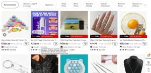
This article talks about an online store called Temu and why it’s so popular. Temu sells cheap and affordable products, uses clever marketing, and has fun ways to make people buy more. The article also warns that while Temu is cool, people should be careful not to buy too much and should know about advertising strategies. So, it’s about why Temu is liked and what to watch out for when shopping there. There is some setting in Temu where it will recommend things you’re interested in and display them on your home page at an affordable price to suck you in.
For example here is a screenshot of my Temu page and there are various things I am interested in.
For science today and last week we have begun learning about volcanoes. Here is my slideshow about different types of volcanoes and some info about them.
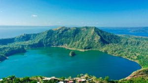
The Taal volcano is located in the Philippines and erupted on the 26th March 2022. Between January 29 and 30, 2022, the volcano had nine phreatomagmatic bursts on its main crater. Then on March 26, the Philippine Institute of Volcanology and Seismology (PHIVOLCS) raised the volcano alert level to level 3, due to a short lived-phreatomagmatic eruption with the evacuation of around 1,100 residents around the area and surrounding towns.
The eruption consisted of increased CO2 flux, seismic swarms, and phreatic explosions. The volcano erupted because of subduction and because of the Philippines’ unique position on the plate boundaries.
(Phreatomagmatic eruptions are a type of explosive eruption that results from magma erupting through water.)
Here is a link to a video of the eruption.
https://www.youtube.com/watch?v=ikUdySBDJsM

Sources: https://en.wikipedia.org/wiki/2020%E2%80%
932022_Taal_Volcano_eruptions#:~:text=Between%20January%2029%20and%2030,the%20area%20and%20surrounding%20towns. https://iopscience.iop.org/article/10.1088/1755-1315/1011/1/012041/meta#:~:text=Results%20show%20that%20the%20evolution,by%20active%20convergent%20plates%20activities.
Yesterday in science we started learning about Volcanoes and their different types. I have created a slideshow showing the types of volcanoes and some basic information about them.